Aires
Aires Tech came to August at a pivotal moment of growth. With a surge in global sales, strategic partnerships across sports and wellness, and a loyal user base, the brand was ready to level up—but its identity hadn’t kept pace. Aires engaged us to evolve its brand from the ground up: to bring clarity to complex ideas, unify its visual and verbal expression, and help position the company for a broader audience while staying grounded in the science that sets it apart.
Our strategy was rooted in clarity: distilling complex science into an intuitive brand experience that resonates across audiences. We refined the visual identity with warmth and precision, reimagined product packaging for retail viability, and created a modular digital ecosystem that helps users understand the tech, explore the benefits, and feel confident in their purchase.
Photography
Vincent Castonguay
Logo
We took a thoughtful approach to evolving the Aires logo—retaining the recognizable icon while refining its construction and reducing its weight for improved legibility across applications. Paired with a modernized wordmark set in a new typeface, the result is a cleaner, more versatile logo that feels aligned with the brand’s renewed sense of clarity and credibility.


Brand Strategy Challenge
Cut through the noise to create a credible, trustworthy brand voice that connects with many audiences and translates complex concepts and new narratives into neutral talking points.


Visual Identity
We approached the evolution of Aires’ visual identity with intention—drawing inspiration from the brand’s existing foundation while reimagining it into something entirely new. By refining what worked and introducing a modern system of typography, a calming-yet-confident colour palette, and flexible layout structures, we brought clarity to complexity and warmth to innovation. The result is a brand that feels trustworthy, accessible, and unmistakably future-forward.


Gradients
To add texture, depth and brand recognition, we introduced a series of gradients inspired by EMF waves. This elegant device serves as a backdrop to content, giving static layouts a sense of motion. The system is comprised of four levels of gradients, increasing in intensity to match the wide array of products and protection Aires offers.


Content Strategy
To bring the new Aires brand to life across every touchpoint, we developed a scalable image system designed to flex from campaign to conversion. Our content strategy balances elevated brand storytelling with practical, real-world application—pairing aspirational campaign imagery with lifestyle, product, and creator-led content.
Each content type was crafted to meet users where they are in the funnel, increasing awareness, deepening consideration, and driving purchase. By art directing a new hero campaign in partnership with Montreal photographer Vincent Castonguay, we established a premium yet approachable aesthetic that sets Aires apart in the category. The result is a cohesive, visually compelling system that strengthens brand recognition, builds trust, and creates consistency across platforms.


Packaging
Aires’ new packaging brings the brand’s innovation to life—visually and verbally. By refining the messaging and introducing a sleek, gradient-led system, we’ve created a packaging experience that not only informs but stands out—designed for today’s consumer and tomorrow’s retail shelves.


Social
We designed a flexible set of social media templates that translate Aires’ refreshed identity into everyday content. From education to engagement, the toolkit ensures consistency while giving the in-house team the freedom to move fast and communicate clearly.


Website
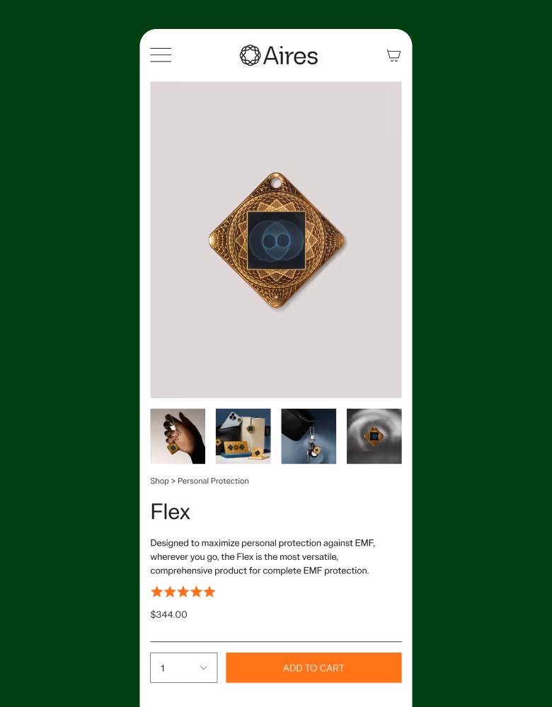
Built on Shopify, the new Aires Tech site blends clarity with flexibility. We simplified complex information through intuitive design, while developing custom modules to give the team control and consistency. The result is a site that educates new users, supports conversion, and scales with the brand.